
Leisure for All
The physical accessibility of Pittsburgh's restaurants
The visitability of Pittsburgh's restaurants
An interactive data-visualization which utilizes Yelp's Open Dataset to visualize the physical accessibility of restaurants in Pittsburgh. Designed to be used as a tool for decision-making in the going out to eat process by specially-abled people.
Team: Vikas Yadav
Role:prototyping, interface design, data visualization, research
Duration: 1 month (Fall, 2016)
Brief: Dive in the process of conceiving and crafting, visual, aural and temporal representations of data that communicates information in a way that is useful and desirable. Pay close attention to patterns that emerge.
Designed for Yelp Dataset Challenge
Leisure for All maps accessibility of all restaurant of Pittsburgh. Important parameters that can guide specially abled residents to enjoy a meal out with their friends have mapped. To answer the question "Leisure should be for everyone but is it equal for all?", we have mapped an example neighborhood from Yelp's Open Dataset to show the look and feel of the complete visualization.
Leisure for All maps accessibility of all restaurant of Pittsburgh. Important parameters that can guide specially abled/disabled people to enjoy a meal out with family and friends have mapped. In order to answer the question "Leisure should be for everyone but is it equal for all?", we have mapped an example neighborhood, East Liberty, from Yelp's Open Dataset to show the look and feel of the complete visualization.
Leisure for All maps accessibility of all restaurant of Pittsburgh. Important parameters that can guide specially abled/disabled people to enjoy a meal out with family and friends have mapped. In order to answer the question "Leisure should be for everyone but is it equal for all?", we have mapped an example neighborhood, East Liberty, from Yelp's Open Dataset to show the look and feel of the complete visualization.
Leisure for All maps accessibility of all restaurant of Pittsburgh. Important parameters that can guide specially abled/disabled people to enjoy a meal out with family and friends have mapped. In order to answer the question "Leisure should be for everyone but is it equal for all?", we have mapped an example neighborhood, East Liberty, from Yelp's Open Dataset to show the look and feel of the complete visualization.
We kickstarted the project with finding a dataset that personally matters to us and can create an interesting conversation through its representation. In order to provide this, our dataset should have been rich enough to have multiple factors on the topic of leisure, which me and my peer mutually agreed to work on Max Neef's "Classification of Fundamental Human Needs".

While we are searching for a dataset to work on the project, we have come across many kinds of interesting challenges such as "one million song" dataset or Spotify-sponsored monthly music hackathon. Then we have decided to take on Yelp's Open Dataset Challenge in a designerly way since almost all previous winners have been from non-design or more technical fields.
We have used Google Data Studio to purge and better understand our data, which includes over 86k businesses with over 566k attributes such as hours of operation, parking availability, ambiance, noise levels etc. We decided to go with Pittsburgh's data, which was one of ten cities included in the set. Data Studio was an effective tool to understand and see patterns in our dataset.


After evaluating our dataset, we have noticed that not all restaurants in Pittsburgh are physically accessible by specially-abled people. To highlight this issue, we have decided on putting our main focus to the accessibility of the restaurants and create a tool to help people to see the overall status of the Pittsburgh in city, neighborhood, and individual restaurant level.

Before jumping on the visual representation, we have finalized our data/category/type pairings and also discussed our final medium of presentation. For making it useful for our potential users, we have decided on building it as a mini-website, which may be a part of Yelp's eco-system.
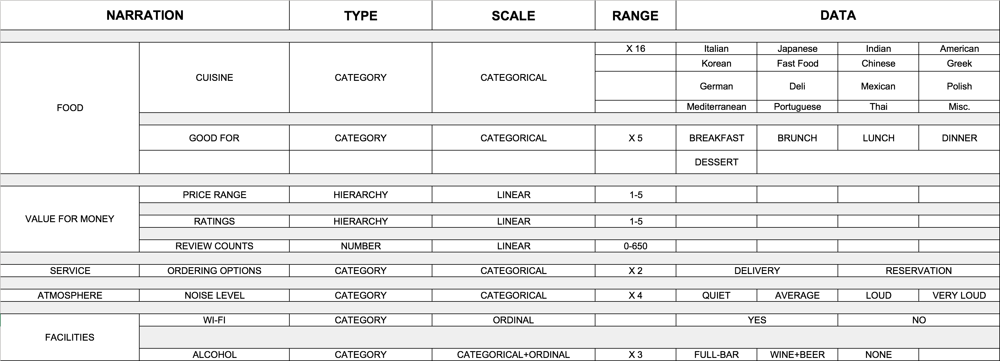
One of our personal goals for the project was being able to visualize multiple different data categories into a single page or screen. In order to do that efficiently, we have got help from Nathan Yau's "Data Points", which helped us to use different visual cues, that have helped us to aggregate multiple data in a clean and easy-to-understand way.

We have started our visualization by thinking about how people will access it. We agreed on this tool/visualization should be advertised on Yelp's homepage to gather attention.

The welcome screen consists of an overall, neighborhood-wise map of Pittsburgh's restaurants.
Data Attribute: Wheelchair Accessibility
Visual Representation: Thin Strokes

Each neighborhood can be accessed in detail with individual restaurants. The UI is mostly composed of toggle buttons for a familiar interaction.
Data Attribute: Names of Restaurants
Visual Representation: Strokes
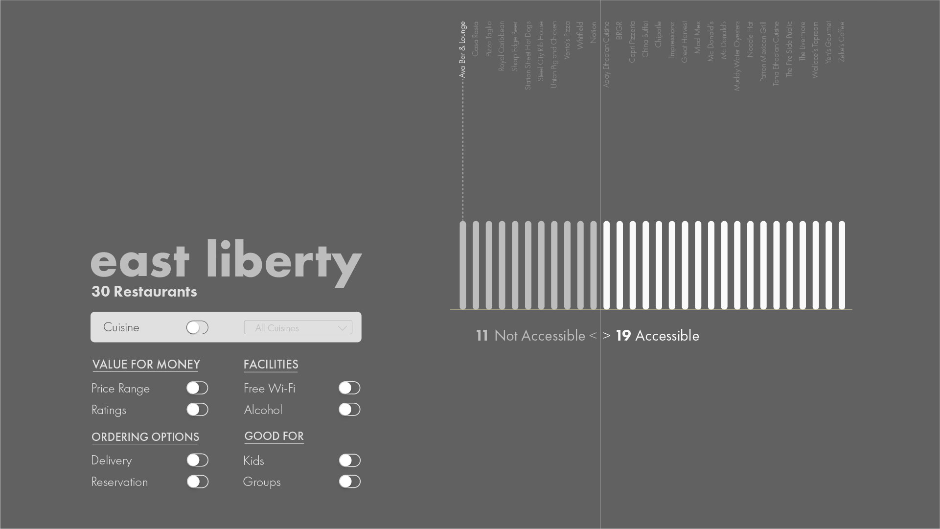
Pressing cuisine toggle activates a drop-down menu, which lists all cuisines available in the neighborhood. For assisting users, we have mapped each cuisine using color with their respective flag of the country of cuisine origin.
Data Attribute: Cuisine
Visual Representation: Color of the Stroke

Each restaurant's price range ($ to $$$$$) is represented by the length of their stroke.
Data Attribute: Price Range
Visual Representation: The Length of the Stroke

Each restaurant's rating scale (1 to 5) is represented by the number of the white dots underneath their stroke.
Data Attribute: Ratings
Visual Representation: Number of White Dots

Each restaurant's availability of free wireless network represented by a literal wi-fi symbol.
Data Attribute: Free Wifi Availability
Visual Representation: Wifi Symbol

Status of alcohol serving is showed by the haziness of their strokes.
Data Attribute: Alcohol Serving Status
Visual Representation: Haziness

Each restaurant's suitability for groups is represented through the distance between the white dots of the ratings.
Data Attribute: Good for Groups
Visual Representation: Distance between "Ratings (White) Dots".

Each restaurant's suitability for families is represented by the size of the white dots of the ratings. If a restaurant offers a home delivery, its connection with home shown with a house symbol.
Data Attribute: Good for Kids (Families) | Home Delivery
Visual Representation: Size of the "Rating Dots" | House Symbol

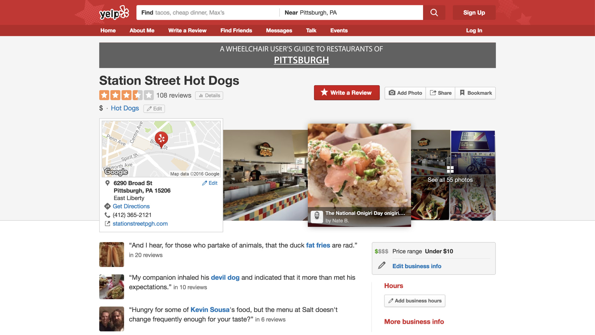
At the final step, we have also provided a hyperlink to the restaurants Yelp's page so that visitors can view its contact or detailed information.
Please note that only published projects are visible in the portfolio grid.